
WHAT IS FIGURE SKATING STORE?
Figure Skating Store is a one-stop-shop that ships figure skating apparel, skates, and supplies worldwide. For this challenge, I was tasked with a total site redesign and overhaul. Given my long history and love of the sport, I was excited about the opportunity.
A major hurdle to overcome was a lack of an intimate face-to-face fitting and purchasing experience. It’s the primary reason so many figure skaters prefer to shop in-person at brick-and-mortar retailers they know and trust. Figure skating is a technical sport that requires greater knowledge and expertise for its sellers, in order to accurately fit and sell products best suited for the customer. How might we enhance Figure Skating Store’s navigation, content, and brand so their customers will feel confident and comfortable with the items they purchase from an online store?
Role: Sole UI/UX Designer
Tools: Sketch, Illustrator, Marvel, Miro, Photoshop
Timeline: 2-Week Sprint

CUTTING DOWN THE COMPETITION
With such a mixed bag of inventory scattered throughout the website, it was immediately apparent, the site lacked navigational organization. Heuristic testing confirmed my hypothesis.
I compiled a list of Figure Skating Store’s biggest competitors. I studied how the competitors organized their inventory and how they approached user intuitiveness in the layout. Using the Plus/Delta competitive analysis approach, I began reviewing Mondor, a well-known Canadian figure skating and dancewear company. Mondor’s site was well-organized and easy to navigate. Their Men’s section was clearly defined, for example, and large, detailed images were used to showcase their extravagant inventory.
When conducting my comparative list, I formulated a tally of three companies with similar inventories to Figure Skating Store: Speedo, Rothy’s, and Capezio. My analysis concluded that there existed an effective throughline in these stores’ organizational methods, which was the key to a successful e-commerce site.
BREAKING THE ICE
I conducted card sorting tests with four participants: two former figure skaters, a former figure skating parent, and one participant who was unacquainted with the sport. Through my interview with the unacquainted subject, it was quickly made apparent the importance of focusing on knowledgeable participants, but that there was also benefit to receiving feedback from those with little familiarity to the sport. Taking from the perspective of those with little familiarity, I could more accurately determine the necessary amount of information needed for a certain level of user understanding and interactivity and gauge the seamlessness of site navigation. We all have to start somewhere.

THE PROBLEM
Figure skaters struggle to find online retailers who offer the combined experience that boasts authentic, high-quality figure skating equipment while providing the knowledge and attention this uniquely technical sport demands.

PAPER PROTOTYPING
Bringing to concept the purchase process from start to finish, I conducted two interviews in which I asked the users to follow the purchasing process for ordering a women’s, white, size 7 Riedell skate set. These interviews revealed that the Boots & Blades section was the primary pain point, as I found they were immediately navigating to the Women’s tab rather than Boots & Blades when beginning their search.
A little background: Boots and blades can be sold separately or together as a set. The more advanced a skater is, the more likely they are to individually pair boots with a separate set of blades, in accordance with their skill set.
CRAFTING A 6.0 EXPERIENCE
Moving from paper to Sketch, I crafted an intuitive purchase process for our customers.
PRACTICE MAKES PERFECT
Through paper prototyping, I understood the benefit of categorizing products by Sex and Age over promoting featured items, such as Boots and Blades, in the primary navigation. Paper prototyping proved to be the most significant contributor to the success of the redesign. Heading into grayscale, I conducted three mid-fi usability tests. I gained the following user insights:

Free Shipping progress bar caused confusion

Need for a confirmation page after purchase

Breadcrumbs were too pronounced

Inactive Like hearts needed to be outlined

Edit/Delete Item buttons needed

Redundant, unnecessary text throughout

ADDING THE GLITZ & GLAM
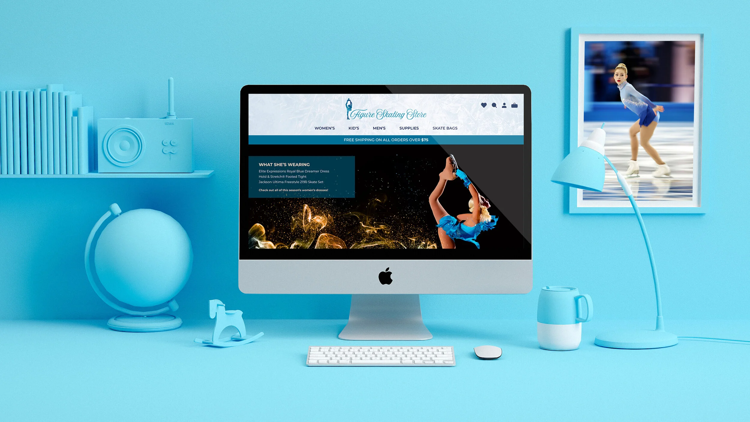
In hi-fi testing, my focus shifted to rebranding the site in a way that would showcase the grace and elegance of the sport of figure skating. For inspiration on the color palette, I referenced a video I discovered of a figure skater training on a frozen lake. From that, I pulled my prominent hues, a pastel blue, and a rose blush.
In keeping with the brand’s new consistency of grace and elegance, I designed a logo for the Figure Skating Store that incorporated an image of a woman in a Biellmann spin, with the store’s name displayed to the right of her.

LIGHTS, CAMERA, ACTION
With the redesign deadline looming, I conducted three usability tests. From those interviews, these were my findings:
Users were unsure why they had to select their boot sizes twice, on two separate screens.

3. The Shopping Bag icon needed a number indicator showing the amount of items added to it.
2. The site lacked a screen displaying the options to Login, Create Account, or Checkout as guest.

SUGGESTIONS FOR IMPROVEMENT
With their comprehensive inventory, Figure Skating Store does a phenomenal job of fitting the needs of every figure skater, at every level of proficiency. In order to exhibit their offerings effectively and become one of the nation’s e-commerce top competitors, I recommend the following:
Add user product reviews to the site
Build brand guidelines and follow them consistently
Recruit a professional photographer to enhance the look of inventory